Bounce N Party Logo Redesign
Let’s have some fun.
Bouncing ideas around.
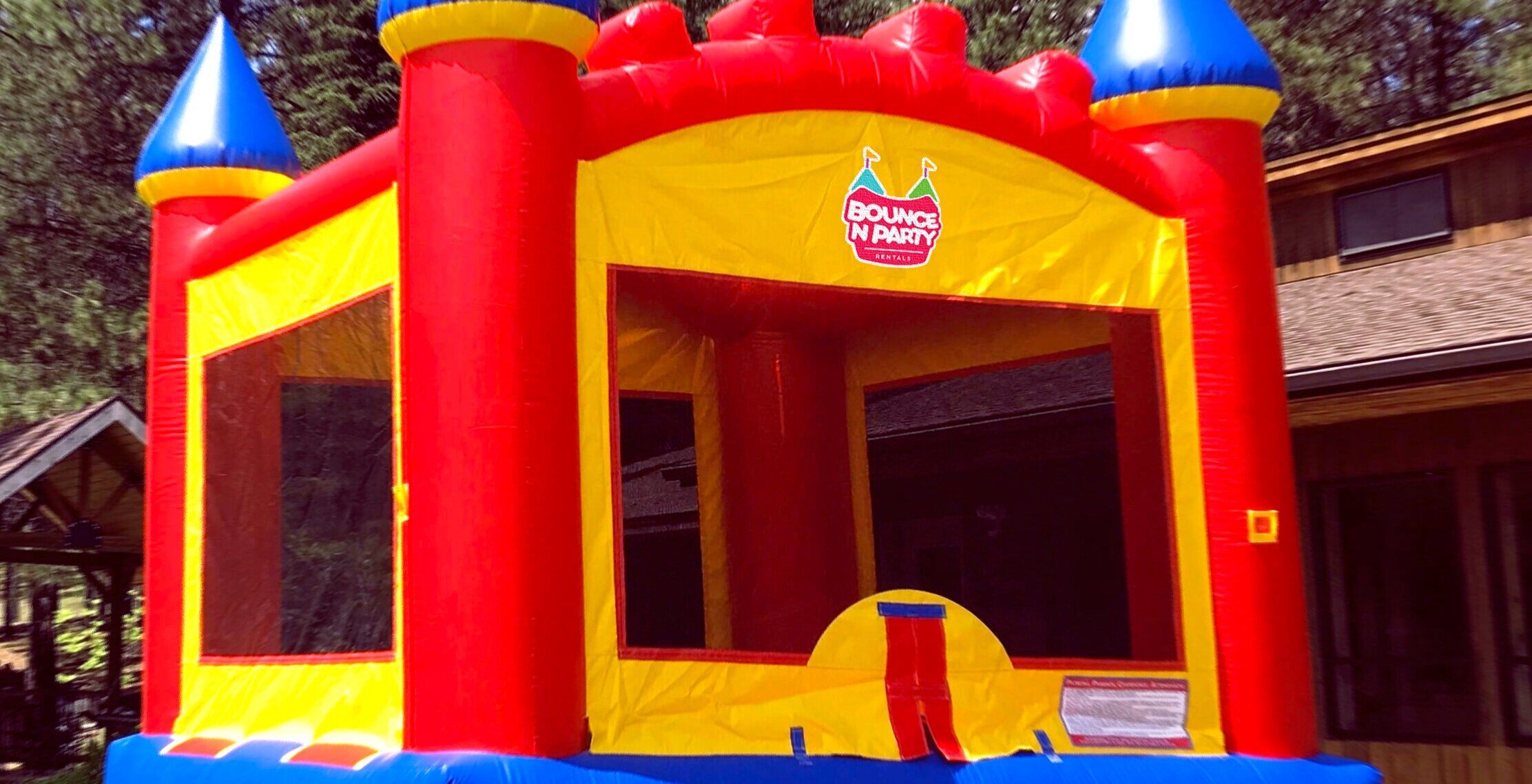
The goal for this logo was to create something refreshing and enjoyable, however, still incorporating Bounce N’ Party’s old design (AKA the flag affixed towers). Designing with the audience in mind was key in making this idea work; We knew that kids would gravitate toward a bright, neon color palette and their parents would appreciate typography with a bit of flare.

One of the biggest obstacles faced while creating this logo was attempting to find a balance between refined and childish aesthetics. While it was crucial for Bounce N’ Party’s branding to appeal to children, their other services - like wedding + party set-up - needed to be acknowledged. The solution was creating a simple, recognizable icon paired with clean, modern, contrasting type, as well as giving everything a curved edge for approachability.
Get the party started.
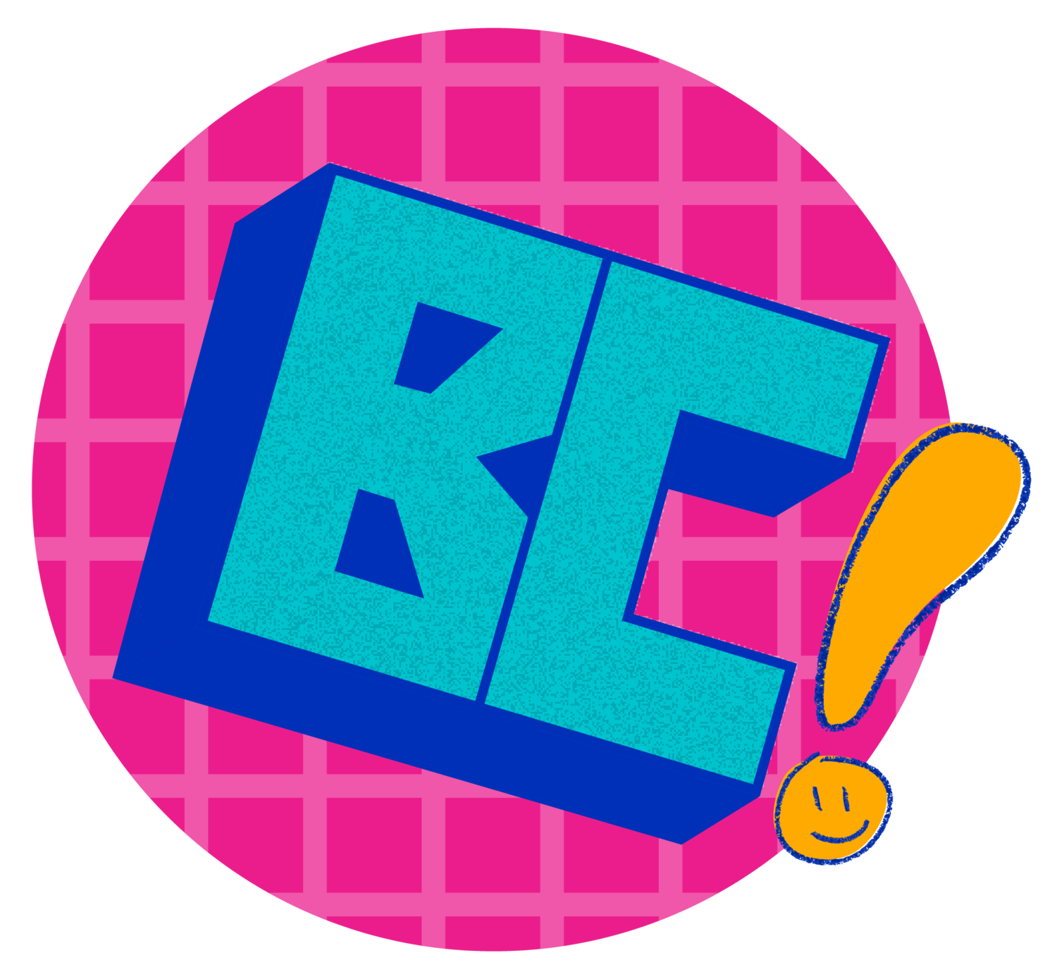
The best part about this logo is the subtle bounce effect the main type takes on. Adding a slight tilt to all the letters truly took this logo to the next level.


