
Period. Interactive Packaging
A passion project for the books.
2020 Gold Addy Award + Best of Show Winner.
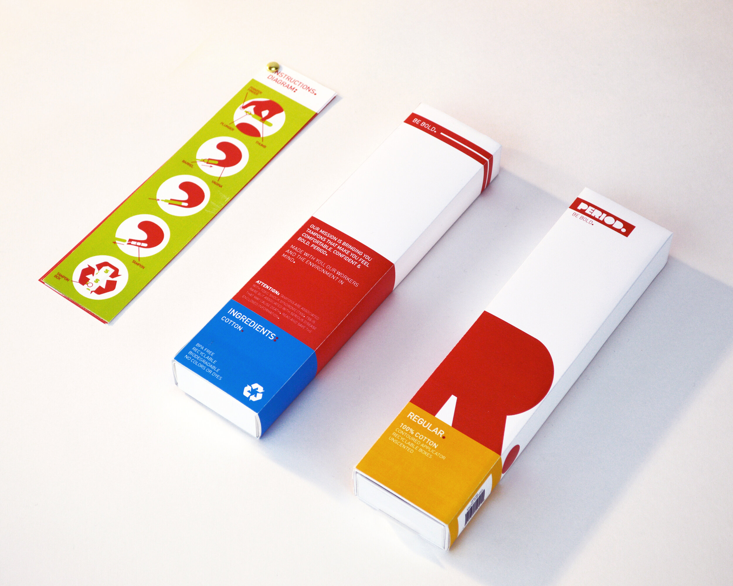
Be bold.
The idea of creating a product like PERIOD. started when I glanced
over at a box of name-brand tampons lying on the bathroom counter.
The amount of information present seemed to be jumping off the container, and the design seemed strictly tailored to appeal to
one group of people.
PERIOD. was designed to contrast this brand, starting with three
goals in mind: audience appeal, portability, and sustainability.

PERIOD.’s mission is bringing its customers tampons that make them feel comfortable, confident, and bold, PERIOD. Their brand is focused on accessibility for all menstruaters, whether they be cis-women, trans men,
non-binary individuals, or anyone else who goes with the flow every month.

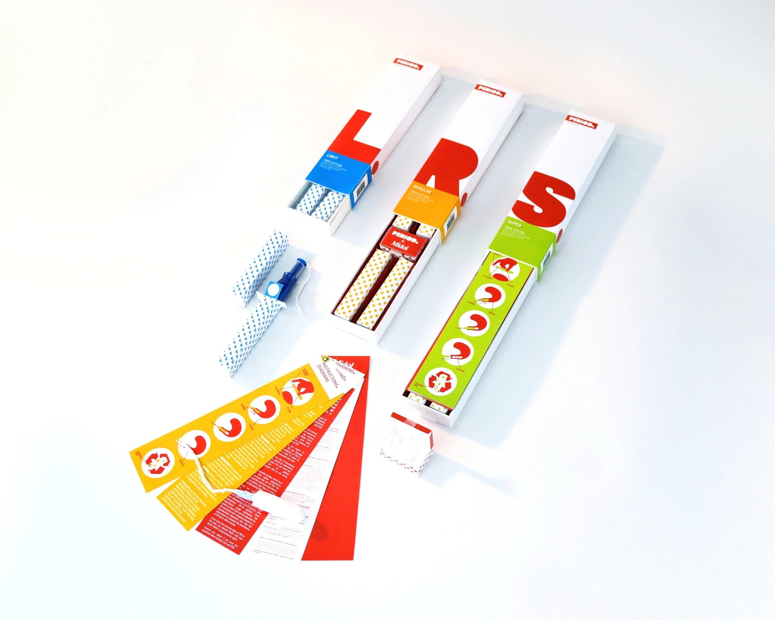
Where’d we leave off?
PERIOD.’s packaging was designed to be portable and discreet if need be, however their brand goal is to instill confidence into their users. PERIOD. believes mensuration is nothing to be ashamed of. Located inside the compact travel cases (standing at approx. 9in tall) are small individual tampon boxes (about the size of the palm of one’s hand). The case comes complete with colorful instructions, and another small box containing 2 Midol pills. By making everything out of sustainable materials, PERIOD. met their final goal: making sure their packaging is as recyclable as possible.