Album Review Social Post - Ethan Bortnick’s Luna Park
Penny for my thoughts?
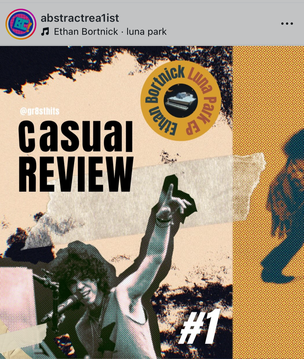
A casual review founded on casual design.
Long-time designers know more than most that sometimes roadblocks lead to more intuitive designs. Learning how to work in various different programs at a moment’s notice is crucial, so I practiced with something low stakes.
Canva and Procreate were the foundational programs for this project; Procreate allowed me to design freely, whereas Canva helped give me a platform to put the pieces together. Combining the two allowed me to create a postmodernist social carousel with the intention to hold intrigue.
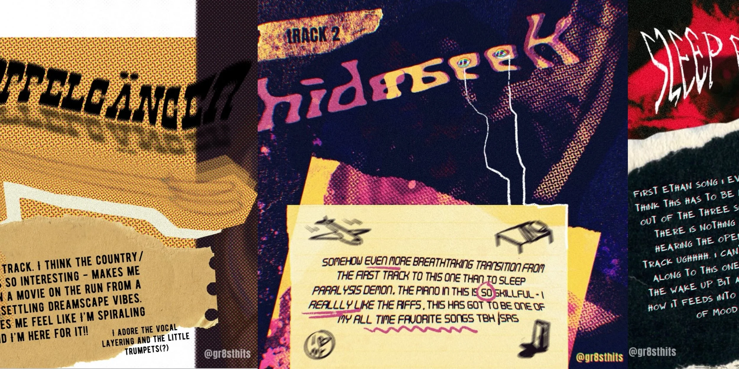
Besides mixing and matching textures with my own illustrations, one of the most crucial elements to this project was making each track title stand as its own piece.
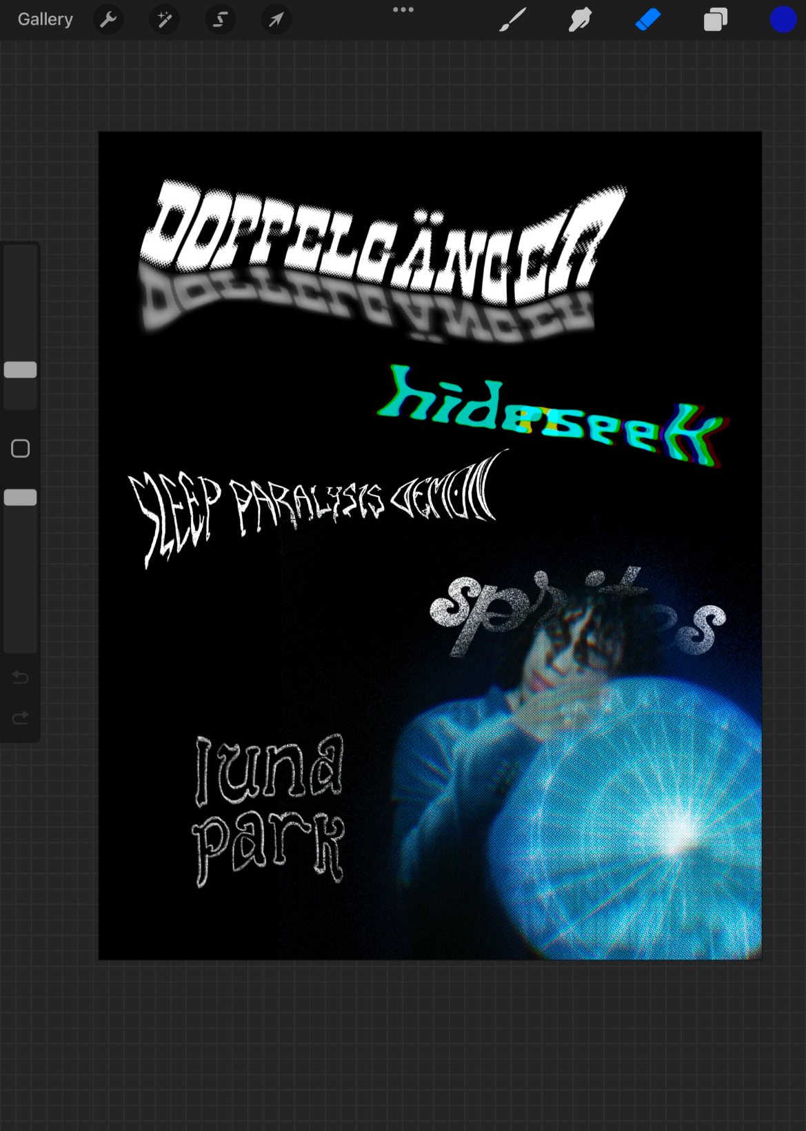
More than just words.
Though the tracks in Bortnick’s EP all flow and work together, each one still has its own distinct character that I wanted to express via varying type treatment. Doppelgänger was an easy one - mixing the western elements from the sound of the song with a duplicate of the word seemed like a no-brainer. Playing actual hide and seek with the letters of the word was a concept I felt the need to see through, and adapting the luna park logo into custom type was the obvious choice for that track.
Curious to see the rest? Find the full post here.