Untapped Potential
Logo Redesign
Searching the PNW for a refresh.
Finding Our Footing.
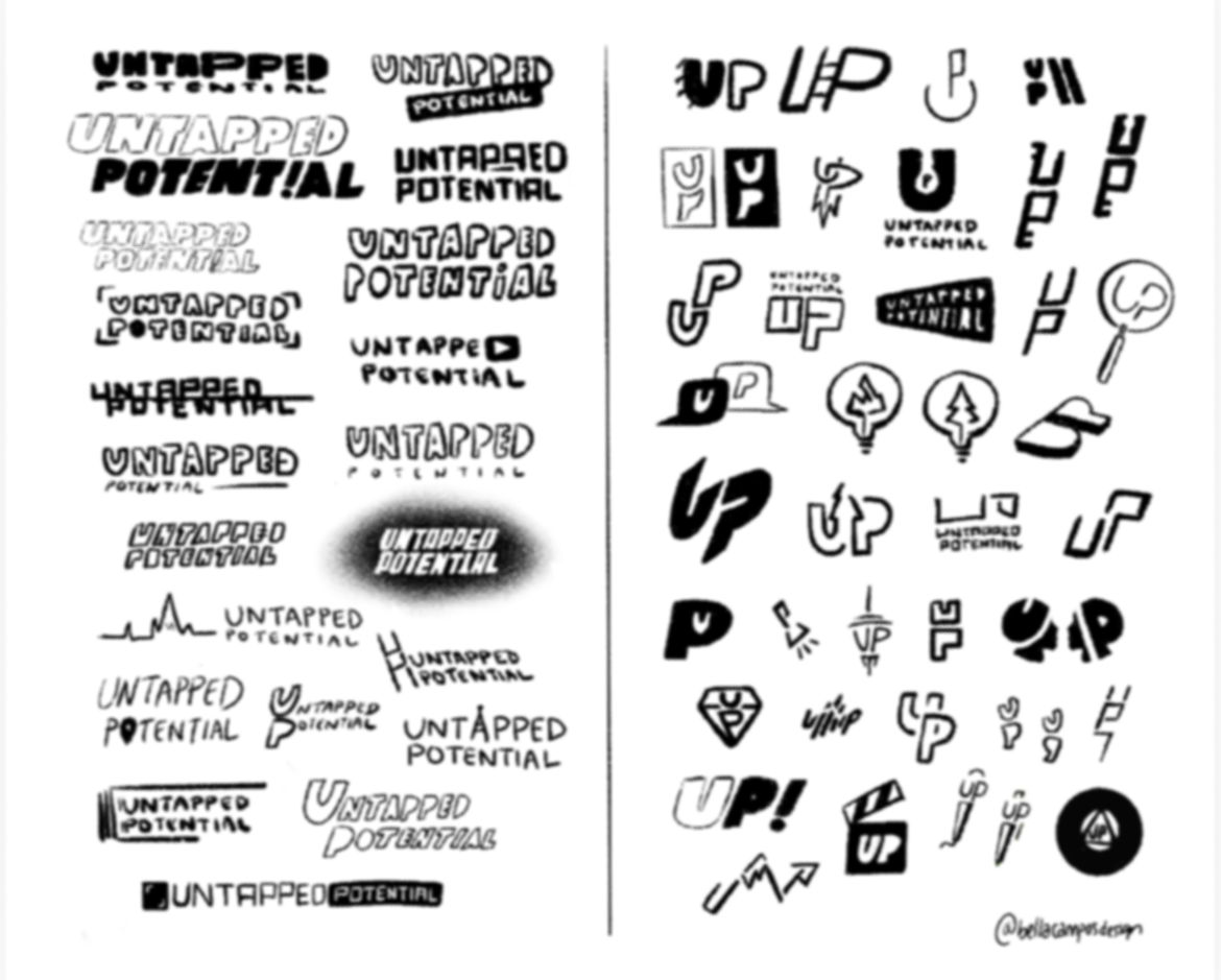
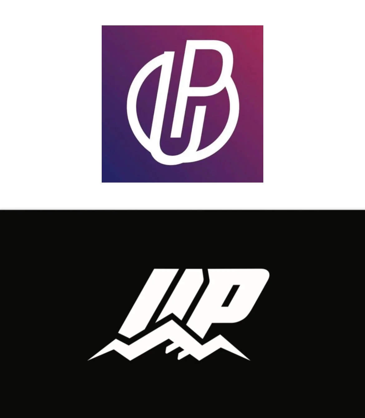
Untapped Potential’s podcast was focused on bringing inspiring personal stories from the PNW to its listeners and viewers. The co-founders had a vision involving elements natural to the PNW as well as warm, and hopeful components. We went through many iterations before landing on the design on the bottom left; There was a drive displayed through the sharpness of almost all the corners, as well as the tilt of the letters. I wanted the final design to show strength, while also having a softness to it that would hopefully not intimidate future viewers. C and M were thrilled with the execution of this vision.

Seattle’s Space Needle and Evergreen trees were large inspirational elements for my design process. While they were very obvious about the concept, they made the logo a tad overcomplicated, so the co-founders leaned toward the simplicity the chosen mountain range design brought.
Problem and Solution.
Originally, the co-founders of Untapped Potential reached out to me for a complete brand re-design package. We discussed new visuals for their YouTube videos, including banners and thumbnail designs as well as creating a stockpile of imagery for future campaigns and social posts.
After laying out the details, I worked with C and M to find a solution that would better fit their budget - that’s how we landed on just logo design at the time.